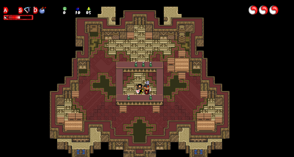
When exploring the vast nature of Classic PC, it is common to notice not only the absolute squalid and unorganized detail of the level, but the revolting tileset as well...see here:

This tileset only puts strain on the eyes and is pure garbage. It looks like the tileset was made by some kindergartener in Microsoft Paint. The grass is green, but the red flowers stick out like a giant zit. There's absolutely no variety in the ground. The only things you'll come across are bushes, grass, and flowers, and they all contain similar colors. The worst thing about this is, when you think you've adapted to the absolute horrid colors being repeated infinitely, you see a BRIGHT BLUE building come out of nowhere. Ouch! Imagine if you were watching a video in the dark where you saw red, green, red, and then suddenly purple starts flashing in your eyes. It's torture to look at.
This tileset is dull. You might as well have only green, white, and red tiles, it seems like that's what Thor was aiming at. Seriously, everything is green. It's dull, it's BORING.

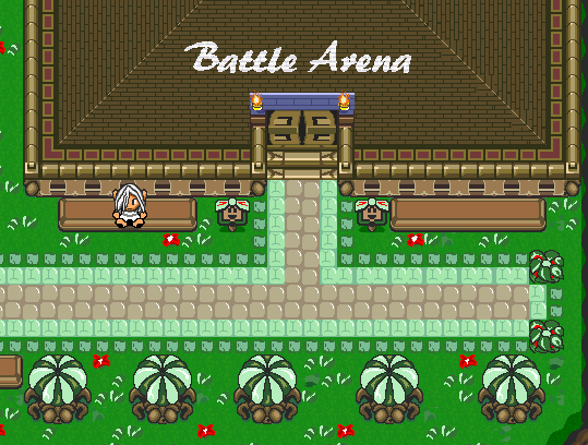
Here we have iPhone's tileset, the default. I must say, this is quite an improvement compared to the desert that is Classic PC. The colors are really bright and elaborate, no two colors seem to be repeating often, and no matter what outfit you wear it always blends in nicely with the environment. Also to note, the stone path does not try to stick out in your face, nor do the yellow flowers. It also seems like the bushes are done a bit more smoothly as well.
In conclusion. Classic PC repeats the same colors over and over again, EVEN ON THE DAMN SIGNS, wheresa the default tileset is bright, colorful, and elaborate. It gives you a warm feeling, it makes you feel like you're at home playing a great game.
 11-16-2011, 01:10 AM


 Linear Mode

