Yes 8am is too early. I hate school, you get up early but atleast you have the evening. But you have to get up early, which i dint want, but I want an evening!
Level:
House:
Okay then. The house isn't too bad. I dont know how many levels you have made, but if you haven't made any its good, and going by some standards ive seen in the past, its generally not bad. The main part that is making it not so pretty are the tiles with grass on them. Now the little pole tiles can be extended to have no bottom to get rid of the middle grass parts, and a chimney could be used to cover up the grass nearer the top. In the bit on the top, you should add some windows, it would look cool and be less plain with just bricks. Overall its good.
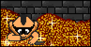
The well
It had to be said, it doesn't look very nice. To be honest it looks like its off another MMORPG I have played before, which is why it doesn't look nice on here. If you use the blue tiles that are sort of like walls, and some poles, you could make a nice well simply from just tiles, but loose that GFX, or if you want to keep it, make all of it water underneath, I can see grass.
Water:
The water is not bad at all. You have used a wide range of tiles to make it look nice, but on the right you have over used the rock bits I think, so maybe a bit of grass or some of that dirt path with water patches on it.
Path Parts:
Im not a fan of this, it looks boring as its all a gray blue to me. I think it would be fine if you had gaps with pther tiles such as dirt paths, grass, shallow water etc, just something to break it up.
Grass:
First of all the raised grass parts, it can make the level look all wrong if it isn't done correctly. Most people use it in different or silly places that dont go together well. The grass detail its self is okay but a bit repeative. Try and use all of the tiles you can with grass, to make it look nice. For example: Swamp, cut bush, the green square off village walkway etc etc...
When you use these tiles put them closer together in groups, and use other parts like trees and water etc to break it up.
Paths:
The brown path in the top needs some work. You have mixed th 2 main borders for paths. You need to use this good. You have used them in a way that looks weird, as it switches alot, so maybe do half of it with one border, then the other with the other!

So..........
Sparks Rating (begginner rating): 7/10
-Read above and edit parts I have mentioned.
Normal Rating: 3/10*
*This is just so you can see you have improvements. You need to carry on working hard and looking over the FULL tileset to make a great level.
 05-09-2003, 03:54 PM


 Linear Mode

