Graal Forums  

Go Back   Graal Forums > PlayerWorlds > Classic Main Forum
FAQ Members List Calendar Today's Posts

Reply
 
Thread Tools Search this Thread Rate Thread Display Modes
  #1  
Old 12-25-2011, 04:03 PM
ffcmike ffcmike is offline
Banned
Join Date: Jul 2004
Location: London
Posts: 2,029
ffcmike has a reputation beyond reputeffcmike has a reputation beyond reputeffcmike has a reputation beyond reputeffcmike has a reputation beyond reputeffcmike has a reputation beyond reputeffcmike has a reputation beyond reputeffcmike has a reputation beyond reputeffcmike has a reputation beyond repute
Send a message via AIM to ffcmike Send a message via MSN to ffcmike
Change to Old Locations

I've mentioned it before within a different thread that I would like to improve the outside appearance of SuperNick's one day.
Low and behold while the Castle Dungeon is still progressing (in terms of the quest by itself, it's something like 5 more levels and the main boss left to complete, with there being 18 levels and the miniboss already complete), FallChild has provided us a helping hand towards renovating the arena:


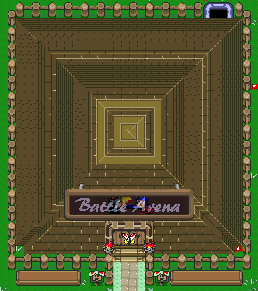
I'd expect most if not all will agree this is an improvement to the original, the wall tiling slightly improves the perspective while the outer fence is more fitting for being outside, with the sign, lamps and door way providing extra detail.

I believe it is also important however that such a historic and recognisable landmark retains its identity (and yes I know the original building at this location was the Northern Limits ).
I've shown this picture to SuperNick himself and he's all for it, so now I'm posting this here to gather thoughts, and to ensure it doesn't come across as too much of a surprise in the event of being implemented.

Edit: Now implemented

Last edited by ffcmike; 12-27-2011 at 10:33 PM..
Reply With Quote
  #2  
Old 12-25-2011, 04:31 PM
callimuc callimuc is offline
callimuc's Avatar
Join Date: Nov 2010
Location: Germany
Posts: 1,015
callimuc is a splendid one to beholdcallimuc is a splendid one to beholdcallimuc is a splendid one to beholdcallimuc is a splendid one to beholdcallimuc is a splendid one to behold
Sexeh
__________________
MEEP!
Reply With Quote
  #3  
Old 12-25-2011, 10:11 PM
FaLLChiLD FaLLChiLD is offline
fcmrcy
Join Date: Nov 2004
Posts: 258
FaLLChiLD has a spectacular aura aboutFaLLChiLD has a spectacular aura about
Send a message via AIM to FaLLChiLD
Reply With Quote
  #4  
Old 12-26-2011, 01:12 AM
James James is offline
LOCAL DOUCHEBAG
James's Avatar
Join Date: Aug 2001
Location: Oregon
Posts: 3,132
James is a splendid one to beholdJames is a splendid one to beholdJames is a splendid one to beholdJames is a splendid one to behold
Send a message via AIM to James
__________________

JAMES BAY PACKERS
2011 FANTASY FOOTBALL CHAMPIONS
2012 FANTASY FOOTBALL CHAMPIONS


“If I can slow it down in my mind... things will be fine."

-Aaron Rodgers
2011's NFL Most Valuable Player


Reply With Quote
  #5  
Old 12-26-2011, 01:28 AM
maximus_asinus maximus_asinus is offline
RIP DarkCloud_PK
Join Date: Oct 2001
Location: Canada
Posts: 3,745
maximus_asinus has a reputation beyond reputemaximus_asinus has a reputation beyond reputemaximus_asinus has a reputation beyond reputemaximus_asinus has a reputation beyond reputemaximus_asinus has a reputation beyond reputemaximus_asinus has a reputation beyond reputemaximus_asinus has a reputation beyond reputemaximus_asinus has a reputation beyond reputemaximus_asinus has a reputation beyond reputemaximus_asinus has a reputation beyond repute
can't tell the difference between the two versions but that is a good thing I think.
__________________
Save Classic!
Reply With Quote
  #6  
Old 12-26-2011, 06:40 AM
FaLLChiLD FaLLChiLD is offline
fcmrcy
Join Date: Nov 2004
Posts: 258
FaLLChiLD has a spectacular aura aboutFaLLChiLD has a spectacular aura about
Send a message via AIM to FaLLChiLD
Quote:
Originally Posted by maximus_asinus View Post
can't tell the difference between the two versions but that is a good thing I think.
Click image for larger version

Name:	oldSN.png
Views:	161
Size:	29.5 KB
ID:	54120

It was important to hold the same essence of the structure whilst improving it's quality and perspective (when shown you can see major differences - I'd say it's a good thing that you couldn't recall based strictly off your memory; shows that the intentions were achieved).

Let's hear some more input Classic players!

Last edited by FaLLChiLD; 12-26-2011 at 12:32 PM..
Reply With Quote
  #7  
Old 12-26-2011, 05:04 PM
MattKan MattKan is offline
the KattMan
Join Date: Aug 2010
Location: United States
Posts: 1,325
MattKan is a splendid one to beholdMattKan is a splendid one to beholdMattKan is a splendid one to beholdMattKan is a splendid one to beholdMattKan is a splendid one to behold
Send a message via AIM to MattKan
Works for me. Definitely looks nicer with the wall tiling, and I never did get that carpet edge around it, so it looks good without that.

The biggest issue is something that didn't get changed: the perspective of the tip of the top of the arena. It looks awkward and should be fixed somehow. Bottom looks loads better though.

And I just noticed that it's a bit smaller than the old arena. Maybe if you made it a couple of tiles bigger...
Reply With Quote
  #8  
Old 12-26-2011, 06:06 PM
FaLLChiLD FaLLChiLD is offline
fcmrcy
Join Date: Nov 2004
Posts: 258
FaLLChiLD has a spectacular aura aboutFaLLChiLD has a spectacular aura about
Send a message via AIM to FaLLChiLD
It's the same size, the carpet tiles around the old one are playing mind tricks on you. As far as the top goes this is the best perspective achievable, with these tiles, in a pyramid design.
Reply With Quote
  #9  
Old 12-27-2011, 04:12 AM
WhiteDragon WhiteDragon is offline
Banned
Join Date: Feb 2007
Posts: 1,002
WhiteDragon is a splendid one to beholdWhiteDragon is a splendid one to beholdWhiteDragon is a splendid one to beholdWhiteDragon is a splendid one to beholdWhiteDragon is a splendid one to behold
+1 from me, looks good.
Reply With Quote
  #10  
Old 12-27-2011, 10:45 AM
Luda Luda is offline
Registered User
Join Date: Aug 2005
Location: Canada
Posts: 2,071
Luda has much to be proud ofLuda has much to be proud ofLuda has much to be proud ofLuda has much to be proud ofLuda has much to be proud ofLuda has much to be proud of
Send a message via AIM to Luda
Looks good I guess.. I'm not liking that sign though or the crappy door(s)
Reply With Quote
  #11  
Old 12-27-2011, 11:11 AM
ffcmike ffcmike is offline
Banned
Join Date: Jul 2004
Location: London
Posts: 2,029
ffcmike has a reputation beyond reputeffcmike has a reputation beyond reputeffcmike has a reputation beyond reputeffcmike has a reputation beyond reputeffcmike has a reputation beyond reputeffcmike has a reputation beyond reputeffcmike has a reputation beyond reputeffcmike has a reputation beyond repute
Send a message via AIM to ffcmike Send a message via MSN to ffcmike
Quote:
Originally Posted by Luda View Post
Looks good I guess.. I'm not liking that sign though or the crappy door(s)
So is there actually something wrong with the sign?
It's impossible to distinguish between that or it just being a matter of personal preference against the sign even being there. It's there to provide a base for the text, plus the 2 characters are the 2 Pachuka outfits which SuperNick used one of.

The door is a pair of crossed swords which splits across the middle to open.
Reply With Quote
  #12  
Old 12-30-2011, 11:11 AM
FaLLChiLD FaLLChiLD is offline
fcmrcy
Join Date: Nov 2004
Posts: 258
FaLLChiLD has a spectacular aura aboutFaLLChiLD has a spectacular aura about
Send a message via AIM to FaLLChiLD
I honestly may have plans to redo the sign to look nice, (that work was done quicker then lightning) so don't get too nitpicking bout these small things. As far as the door goes, I've had a plethora of positive comments that it was their favorite part. Personally I think it fits (as do the rest of the staff).

I really appreciate the positive input from the community and am glad to see it were implemented (a good amount of hours weren't spent renovating. Also big thanks to Thor for overseeing changes and keeping things in check.

Last edited by FaLLChiLD; 12-30-2011 at 11:45 AM.. Reason: Gratitude
Reply With Quote
  #13  
Old 12-31-2011, 03:04 AM
Luda Luda is offline
Registered User
Join Date: Aug 2005
Location: Canada
Posts: 2,071
Luda has much to be proud ofLuda has much to be proud ofLuda has much to be proud ofLuda has much to be proud ofLuda has much to be proud ofLuda has much to be proud of
Send a message via AIM to Luda
Quote:
Originally Posted by ffcmike View Post
So is there actually something wrong with the sign?
It's impossible to distinguish between that or it just being a matter of personal preference against the sign even being there.
I think it's the brick tile overlay on the text that annoys me the most, I know that it was originally there when it was actually OVER bricks but this time it isn't.

Quote:
Originally Posted by ffcmike View Post
plus the 2 characters are the 2 Pachuka outfits which SuperNick used one of.
Yeah, I know who the two outfits are, and I don't mind that. Maybe make them into statues like that fountain below MoD fort had, it might not look good but it's a suggestion to experiment with.

Quote:
Originally Posted by ffcmike View Post
The door is a pair of crossed swords which splits across the middle to open.
I can see that the swords cross, but I'm talking about the actual door behind it, it doesn't fit well with the tileset and it looks like it's still in the "sketch" mode. It would probably look better if it was one whole door too, not two seperate ones.
Reply With Quote
  #14  
Old 12-31-2011, 11:52 PM
ffcmike ffcmike is offline
Banned
Join Date: Jul 2004
Location: London
Posts: 2,029
ffcmike has a reputation beyond reputeffcmike has a reputation beyond reputeffcmike has a reputation beyond reputeffcmike has a reputation beyond reputeffcmike has a reputation beyond reputeffcmike has a reputation beyond reputeffcmike has a reputation beyond reputeffcmike has a reputation beyond repute
Send a message via AIM to ffcmike Send a message via MSN to ffcmike
Quote:
Originally Posted by Luda View Post
I think it's the brick tile overlay on the text that annoys me the most, I know that it was originally there when it was actually OVER bricks but this time it isn't.
Ok so the brick lines have been removed from the sign text, there's a raised outline now aswell:

Reply With Quote
  #15  
Old 01-01-2012, 12:30 AM
DustyPorViva DustyPorViva is offline
Will work for food. Maybe
DustyPorViva's Avatar
Join Date: Sep 2003
Location: Maryland, USA
Posts: 9,589
DustyPorViva has a reputation beyond reputeDustyPorViva has a reputation beyond reputeDustyPorViva has a reputation beyond reputeDustyPorViva has a reputation beyond reputeDustyPorViva has a reputation beyond reputeDustyPorViva has a reputation beyond reputeDustyPorViva has a reputation beyond reputeDustyPorViva has a reputation beyond reputeDustyPorViva has a reputation beyond reputeDustyPorViva has a reputation beyond reputeDustyPorViva has a reputation beyond repute
Send a message via AIM to DustyPorViva Send a message via MSN to DustyPorViva
<gauntletvoiceover>Text needs AA badly.</gauntletvoiceover>
Reply With Quote
Reply


Posting Rules
You may not post new threads
You may not post replies
You may not post attachments
You may not edit your posts

BB code is On
Smilies are On
[IMG] code is On
HTML code is Off

Forum Jump


All times are GMT +2. The time now is 11:29 AM.


Powered by vBulletin® Version 3.8.11
Copyright ©2000 - 2024, vBulletin Solutions Inc.
Copyright (C) 1998-2019 Toonslab All Rights Reserved.